The End of the ‘No’ Week

:-)I drink my Jacobs Cronat Gold coffee now (mmmmh…), with honey and cream, and think how beautiful Life is:)

My experiment is over – the week without coffee, black and green tea, beer, wine, chocolate and other things, which contain caffeine, tanine and alcohol:)

And here come the long-awaited results from this experiment:

  1. I survived;-)
  2. I feel good:-)
  3. Everything is much tastier to me now:-)

I may repeat the experiment, one day. But now…

…I plan to have some crispy potato chips tonight (or fried potatos), together with some nice, cold beer, mmmmh;-)

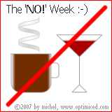
The Week no-Coffee no-Beer no-Wine no-CocaCola no-BlackTea no-GreenTea no-Chocolate :)

Illustration to the No Week, by MichelYes, I am firmly decided. It’ll be this week. I start right now. This morning.

The experiment will continue exactly one week, or 168 hours. From Friday to Friday.

I will exclude from my daily diet everything, which contains caffeine and alcohol, also tannin. Any stimulating or calming chemical substances.

I won’t drink coffee. Regular coffee, and also decaffeinated coffee. Nor soluble coffee. No coffee at all.

I won’t eat chocolate. Nor waffers. You won’t be able to seduce me even with Lindt pralinés (although this one will be tough, If you’ve tried Lindt Lindor, mmmmmh… then you know what I’m talking about;-)

In the evening, I won’t drink a beer or two to relax. The wine also will be included in my “black list”. Same for the tea with some honey and a bit of whiskey, before going to bed.

I won’t drink green tea as well, as it contains caffeine and tannin. Nor black tea. Only herbal infusions and Rooibos tea.

You won’t be able to tempt me with some Coke, too.

Everything which is stimulating and calming goes into this list. You won’t see me even with my favourite Aldo Morelli bent pipe, blowing small beautiful smoke clouds to the wind (not that you can see me with it often, anyway, but this way the list looks more impressive;-)

Read more
The Double Michel – inspired by Rebekka Guðleifsdóttir

Michel has a twin now... An evil twin ;-)I avow, that this post by the famous photographer Rebekka Guðleifsdóttir (no, don’t ask me to pronounce this Icelandic name!:-) inspired me… And also a question on the same subject, which my wife asked me a few days ago:

How this is done? And this?
Can a normal digital camera be used for this purpose?

Can the technique be reproduced using Macromedia Fireworks?

So, here’s the answer:

It could be done using a variety of methods.

Yes.

Yes.

The results are shown above [click on the thumbnail to see the image in full size]:-)

This is it – short and sweet. It’s me in the office today, shot by my small Pentax Optio S40 digital camera. And this is me, again… although, my second me is holding a knife and looks a bit evil;-)

If there’s interest, I may try to write a tutorial on it:-)

Yahoo! Messenger Logo Reloaded – the answer

This is the Yahoo! Messenger logo I have imitated using FireworksA while ago I posted two Yahoo! logos on my website, asking the audience to tell, which one is the original Yahoo! logo made by Yahoo! and which I have re-created using Macromedia Fireworks.

Now comes the long-awaited answer:

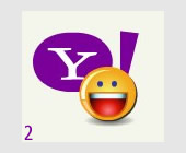
Yahoo! logo #1 is the one I made, and Yahoo! logo #2 is the original Yahoo! logo from the Yahoo! Messenger starting screen, captured as screenshot while the Yahoo! Messenger was loading.

I thank everyone for their participation, votes and comments:-)

I’d like to thank you here especially Alan Musselman from Adobe (formerly Macromedia), whose answer and comment was one of the most thougthtful and thouroughful ones:

Definitely the one on the left (#1). The only way I noticed is the Y is not proper like the Yahoo! branding. :) Good job though… I will also say the shadow on the teeth is a little stronger on #1 as well. If it wasn’t for these two things I wouldn’t have been able to tell the difference. :)

Both remarks are correct – the “Y” wasn’t perfectly made, and the shadow on the teeth is a bit different. Also, a lot of people reported that Y! logo #2 is somewhat saved with a bit worse compression than Y! logo #1 and because of that they presume #2 is the original logo, because probably it’s a screenshot and thus, was saved with worse compression and some artifacts, while #1 was exported from a high-quality vector-based file.

Read more