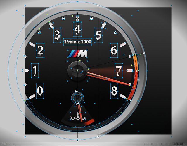
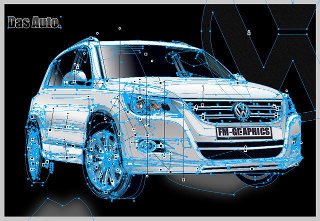
If someone is curious (except me, hehe), then this is how may look a file while I work with it in Fireworks:

On the screenshot you can see selected most of the elements (as vector outlines); some elements in this particular design are also special Symbols and because of that you cannot see their outlines and gradient handles. In the larger version of the screenshot you can also see some of the panels in Fireworks (although a bit darkened, so as to keep focus in the center, on the canvas).
I have often heard people saying that drawing with vectors is not something interesting. I think it is quite the opposite — it’s extremely interesting, just different from drawing with a pencil or with a Wacom tablet… And if vectors didn’t exist, wonderful series, like Ani’s Friday Bunny or TheOatmeal‘s comic strips, wouldn’t be possible!
Sometimes, trying to re-create small parts of the real world with the help of vectors, live effects, gradients, layers and sub-layers, lights and shadows, and other similar digital “bricks”, can be both a challenging and time-consuming task…
There are some really crazy illustrators, like Fred Michel (I have mentioned his work in my latest article for Smashing Mag):


(This Volkswagen Tiguan illustration took him at least a few weeks of hard work in Fireworks!)
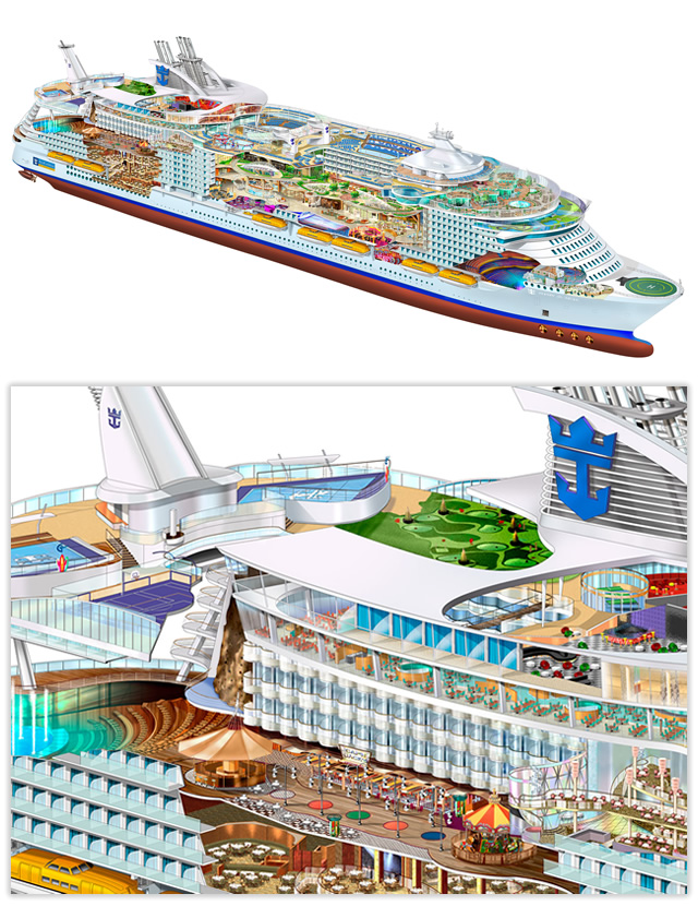
There are even crazier illustrators, who can spend thousands of hours in Illustrator (and Photoshop) and re-create models of real ships, all in vectors!

Yes, not the same as drawing by hand, but beautiful and interesting, in its own way!
And drawing with Fireworks is very fun! It’s true that Adobe Fireworks is not as powerful as Adobe Illustrator — but on the other hand, it’s easy to use, it’s more intuitive, and it can do one thing extremely well (design for Web and screen), instead of trying to do all things at the same time, like the latest version of Photoshop, which tries to be a photo editor, a Web design tool (quite cumbersome and hard to use, IMHO), a 3D application, and also a coffee machine (note: coffee making option will be available only in the next version of Ps;-).

With Fireworks, almost anyone can start learning to combine colors and shapes just within a few minutes; in Fireworks, you can work in a mixed vector/bitmap mode, which gives a lot of flexibility to the designer; adding, removing and editing of live effects is very easy; gradients are a few times better than those that you can find in Ai и Ps; the unnecessary complexity of the “Layers, Sub-layers” concept is missing (a concept that is typical for Photoshop) — layers do exist in Fireworks, but you rather work with objects, which speeds up your work; you can create simply funny (or useful) small animations very fast; and there are many other things, which are probably a matter for another blog post…
Of course, work with vectors you can also do in Illustrator, Flash, CorelDraw, Inkscape, and many other programs (commercial and freeware ones) — we all have our tool of preference. For me (because what I mostly do every day is “pushing pixels”, for the Web and screen), this is Fireworks — I think that at the moment this is the best tool for the job.
* * *
Maybe I’ll dedicate more attention to this topic some other time, but now I’d like to finish with a little note about my Daily Design project, which little by little became a Weekly Design project… ;)
The idea was very different, at the beginning of this year. But while I was trying to invent something new each day, some design doodle or illustration, I’ve found out that ideas become more and more scarce and when bringing them to life, I had two choices: make things really well, in greater detail (but I needed to spend quite a few hours for this purpose), or make something very quickly (but with not much attention to detail). At some point I preferred to stop trying to catch some schedule, and instead waited for the good ideas to come, and then dedicated up to a few hours to make their close-to-perfect implementation.
Well, one might say that I failed in my original idea to create something new every day, for one year; on the other hand, I actually succeeded, because by the end of the year I will probably have at least 50 new illustrations/designs, created for my own pleasure, and will also learn new tricks and techniques in the field of digital design! :)
…And now, if you please excuse me, I have to go — I have an important appointment with a vector bunny friend, who is afraid of being watched — I think I’ll be watching him closely at least for the next 5 minutes or so! ;)
